i've started off by building my "monsters" for the figure to battle and cut apart
i made 5 out of plasticine and theyre all different shapes and sizes
i used 4 types of plasticine, red ,black, blue and yellow
uchihahovis
Wednesday, 18 June 2014
evaluation for animation
evaluation for animation
the task we were set was to make a stop motion animation. we were originally going to use armatures to create our own characters as well as Plasticine, after a while our armatures began to fall apart because allot of the screws came loose and went missing so most of the class abandoned attempts of using armatures. The software we used to animate was Istop-motion then to edit I used final cut pro to help add in sound effects and background music.
my idea was to use a revoltech figure and Plasticine, the reason I picked a revoltech figure is because unlike normal figures you find in stores, the revoltech figures are 100% pose able meaning you can move almost every part of the their body's to put them in a position you'd like it to be, whether it be in an action pose or in a stance, the figure would be able to be posed without any accidental damage to it. After choosing my figure I started to make monsters of our Plasticine for my figure to battle and "kill" in the 39 second animation. The music and sound effects came from the Pokémon red and blue games and from stock sounds from the Internet. a part of animating that I struggled with was when the set would accidentally move the onion skinning would come out of place so I would have to reposition the entire set again, also I found that I had to be very patient with the animation because I had to take the picture frame by frame, without getting my and in shot, because if I moved ting to fast it would seem like the animation was skipping (like a scratched up DVD) this was because even though i was animation at 24 frames per a second , i used 3-5 frames per a slow motion which caused the animations duration to be longer than i intended. My target audience was manly males from the ages of 13-16 with an interest in anime, cosplay and manga. I believe I succeeded in making an animation for this audience from my audience feedback below.
The colour scheme for my monsters was based off of spider man (red, blue and black) which was a reference for comic book fans to pick up, from the feedback i got i think nit may have been to subtle to notice.the idea for my set was that it was a field but there wasn't enough astro-turf to fill the set so instead i painted a trail of red meant to look like blood and had bits of astro-turf on-top of green painted cardboard.
some audience feedback I was given was that there was allot of camera movement, I did this to make it seem as if the floor and surroundings were actually shaking, rather than to move my set constantly and have pieces and characters fall all over the place. another piece of feedback I was given is that the effects stand was in shot and should have been edited out to make the video look better, the audience also commented on the fact that the video slowed down and sped up in parts and should be edited so it goes at the same pace throughout. Most of my audience thought that my final animation would be broadcasted on YouTube with the target audience being action, anime and fantasy fans. A different part of the audience commented that the movement could have been made soother but the sound effects worked well to make it clear it was a fight scene. When shown to a media teacher the feedback I received was that the animation was well lit and that the the colours and characters were interesting , the music gave the animation a good pace but the actual animation didn't match the pace of the music and the stand being it shot brought down the quality of the animation. The attempt of using a panning shot in animation was commented on as ambitious but was also said to be very jerky, it had nothing that offended any ethnicity but didn't really attracted anyone but the predominantly male audience from ages 11- 19. after the previous feedback i was told i could host and broadcast the animation on YouTube as a new animator or because the density of information works well on a small screen and may be seen as an ident at festival or convention which could include or add a logo at the end. overall it seems like the animation itself isn't complete or the beginning of an animation it looks like a small part of a bigger animation.
I found that by using a figure my animation didn't have a risk of someone dropping my character so it wouldn't fall apart like an armature, this was a strength but my product had its weaknesses such as some of the set wasn't entirely painted because I didn't want to use that bit of it but due to space constraints I had to have the camera at another angle so that the set could fit the table right next to the mac. overall I think my product could have been better but wasn't as bad as I thought it would look, I think after better editing and re shooting I could make it allot better by making the animation smoother so the animation did not look like it was skipping . personally i think i can improve the animation by re-editing it so that the pace is evened out and matched the pace of the music or even re shoot the whole video and use each frame for a different movement so it doesn't jerk and skip , also i would make sure the effect stand wasn't in shot, then edit it in time to the sounds and effects.
Tuesday, 17 June 2014
Monday, 16 June 2014
animation in advertising
animation has been a major vehicle for advertisement. In fact, animated adverts predate animated features by many years. In the
early 20th century, when Vaudeville was giving way to silent movies,
animated ads for various products were often shown on the big screen,
accompanied by sales pitches.
Gertie the Dinosaur was the first character-based animated feature and came to the screen in 1914.
As animation became more advanced, adverts continued to be important. Today, many well-known mascots and beloved advertising campaigns are delivered through animation:including the talking m and ms,compare the markets meerkats, the monkey from pg tips and even the wallace and gromit adverts that are being used.
Stop motion allows you to cheaply recreate and mock famous films or television of the time. A example is the 1976 Chewit’s advert (the video above) made by French Gold Abbott and created by John Clive and Ian Whapshot. The advert shows a Godzilla type creature rampaging through cities and eating famous landmarks. It was such a success that the sequel was delayed to give the advert a cult status. The advert allowed the confectionery company to cheaply and effectively satirize the work being done by Ray Harryhausen in cinemas.
back in 2009 this advert was made using stop motion and used Plasticine to create the characters as we did in our animations. the characters are from the show creature comforts. it uses real interviews and replaces the people with stop motion animation and this was shown on channel 4.
Gertie the Dinosaur was the first character-based animated feature and came to the screen in 1914.
Wednesday, 26 February 2014
Friday, 24 January 2014
ideas
ideas :
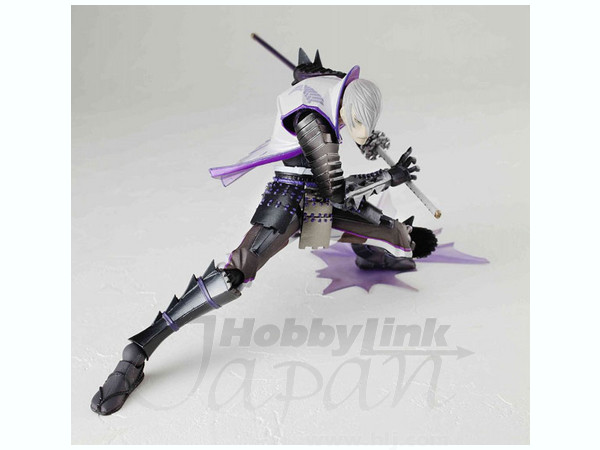 |
| you can faintly see the joints on the figure holding it in position |
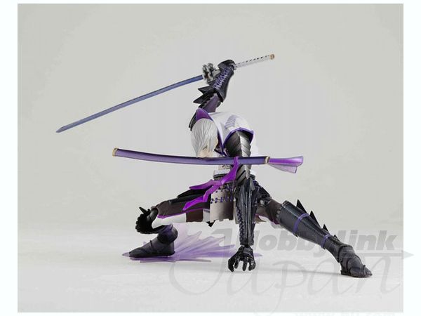 |
| one of the many poses that these figures can be put into. |
in my pitch i started talking about a figure fighting Plasticine, the figure i intend to use is by revoltech a Japanese figure line by the company Kaiydo. in the two pictures above it shows how easily the figure is able to be posed and can be adapt for stop motion because the joints "snap" in each frame so you can literally move the arm less than a cm a frame , using the special "revolver joint" which is in the picture below the joint clicks every time its moved giving you a slight idea how much your moving the arm, leg shoulder and even torso.the hands are interchangeable like most revoltech figures.
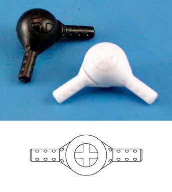 |
| the revolver joint |
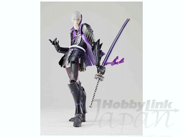
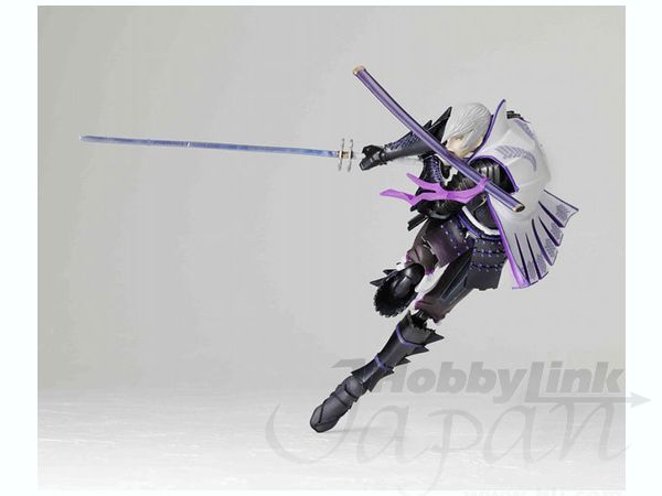
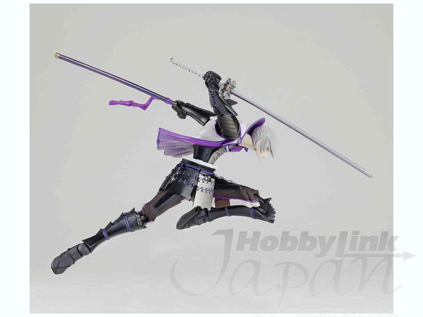
from all of these pictures we can see that revoltech figures have good articulation for different poses and different parts for different purposes. they can be posed very easily and have clear stands that can be edited out easily.so my basic idea was that this figure uses his sword to fight off Plasticine monsters, using the slash effect, given in the box and also using video editing software to create lightning attacks.
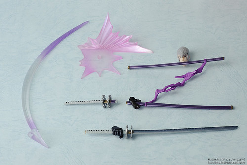 |
| additional pieces , including the interchangeable hands and slash effect and a slide stand |
 |
| some of the additional parts can be seen in the packaging including the slash effect i mentioned below |
Thursday, 23 January 2014
idea plan/pitch
pitch:
- gonna use plasticine, figures and a cardboard background
- figure is fighting off all the plasticine monsters
- plasticine monsters surround the figure
Subscribe to:
Comments (Atom)


